Booksmart
Watch liveBooksmart runs one of the largest book libraries in Southeast Asia, serving both everyday readers and enterprise clients across the region. But having a massive catalog meant nothing if people couldn’t find what they were looking for, or gave up before checkout. High friction across the shopping journey was quietly killing conversions: poor product discovery, and a checkout flow that bled users at every step.
I led an end-to-end redesign of the core journey, from homepage to payment, built around one goal: get people to what they want, fast. Structured categorization, context-rich search, and a progressive stepper checkout cut the cognitive load and shortened the path to purchase.
Faster Access to Booksmart’s Catalog
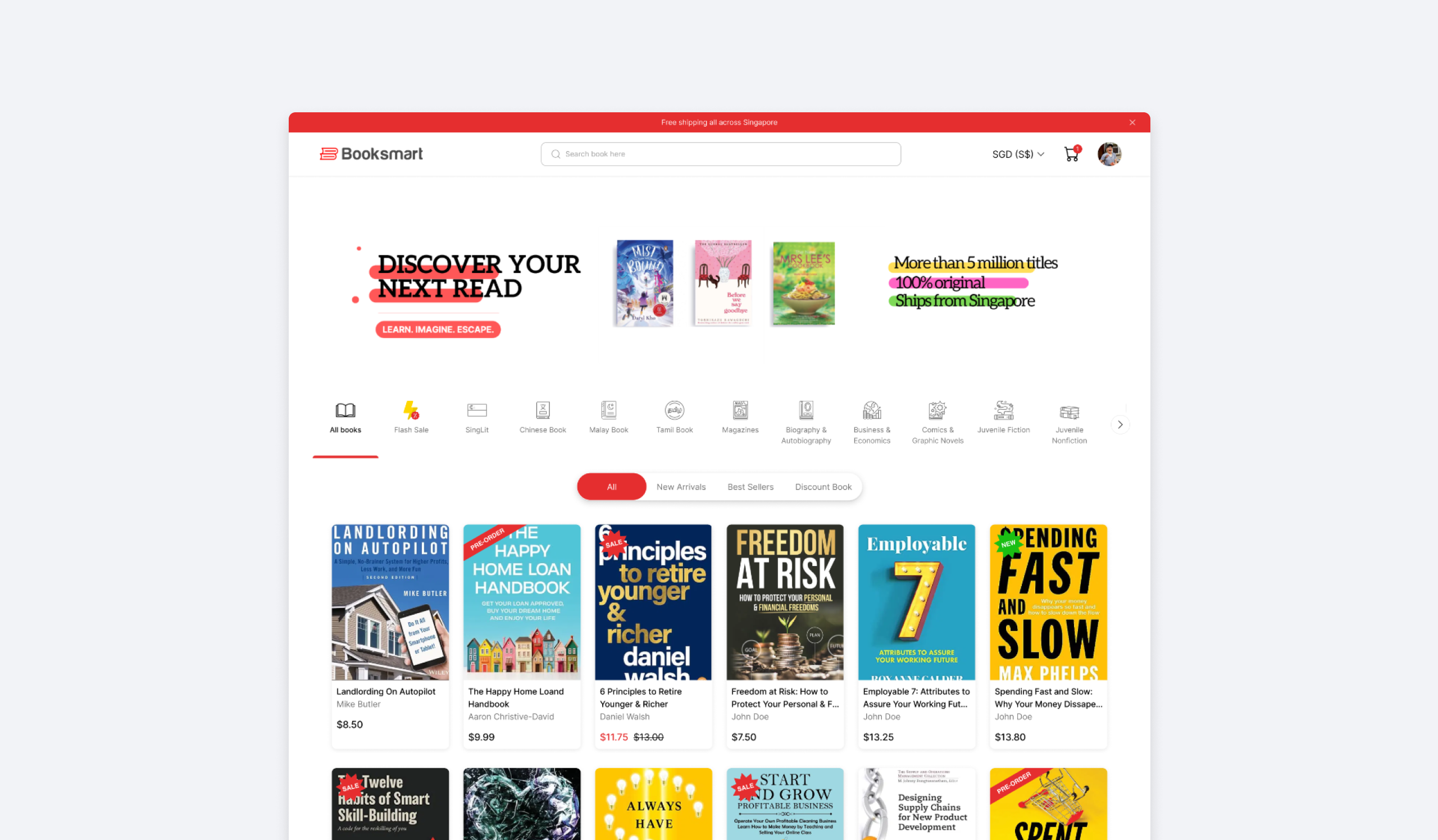
The legacy system caused high navigation friction: categories only showed 7 books, forcing users to click “See All” and load a new page just to keep browsing. I kept users on the Landing Page instead, introducing a two-level filter hierarchy (Category and Sub-category) that updates the catalog instantly without page reloads, drastically cutting the time it takes to find a specific book.
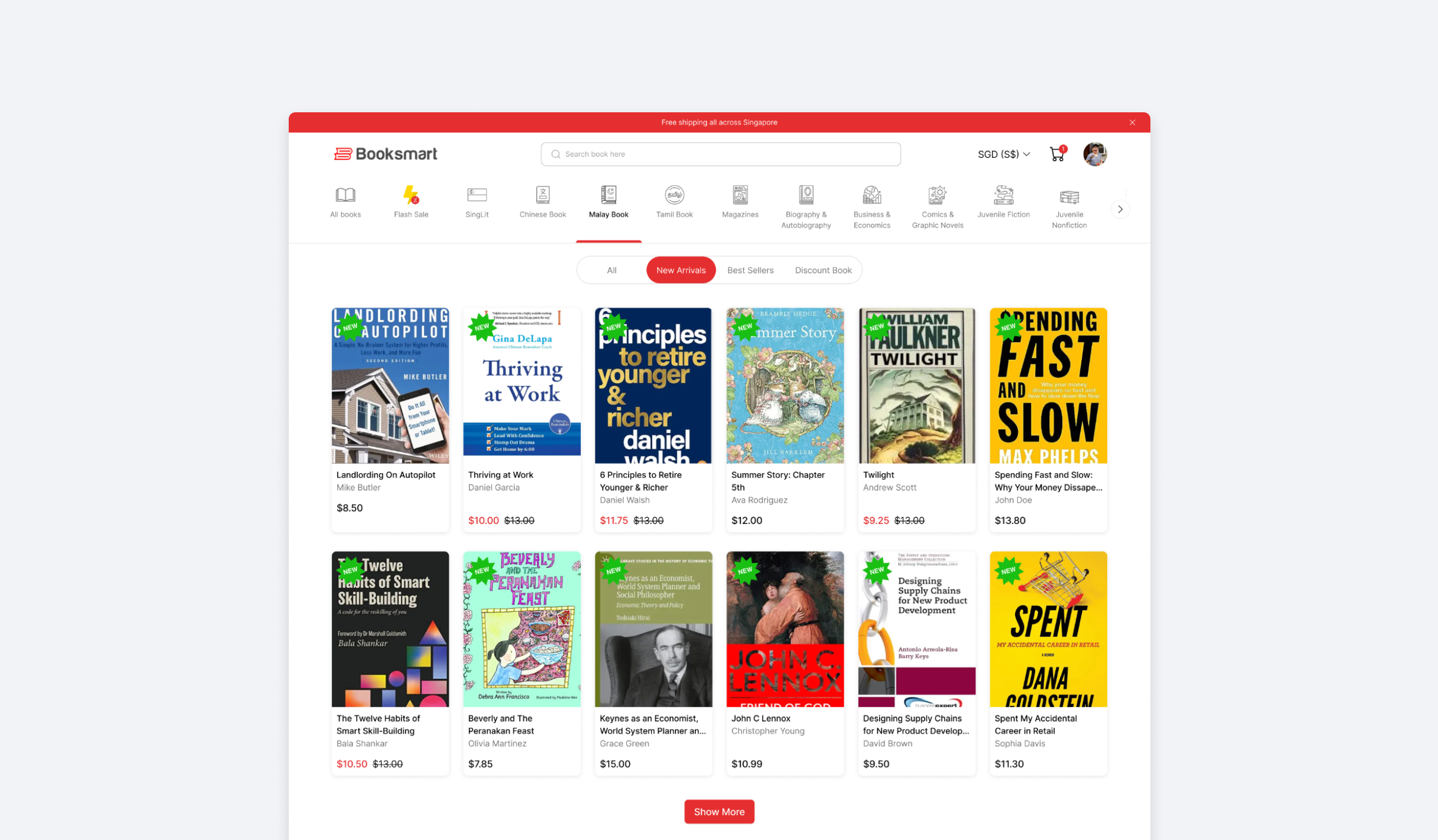
Contextual Sub-Categorization
Segmented controls (New Arrivals, Best Sellers) act as secondary filters, using a familiar UI pattern to instantly narrow results below without adding cognitive load.
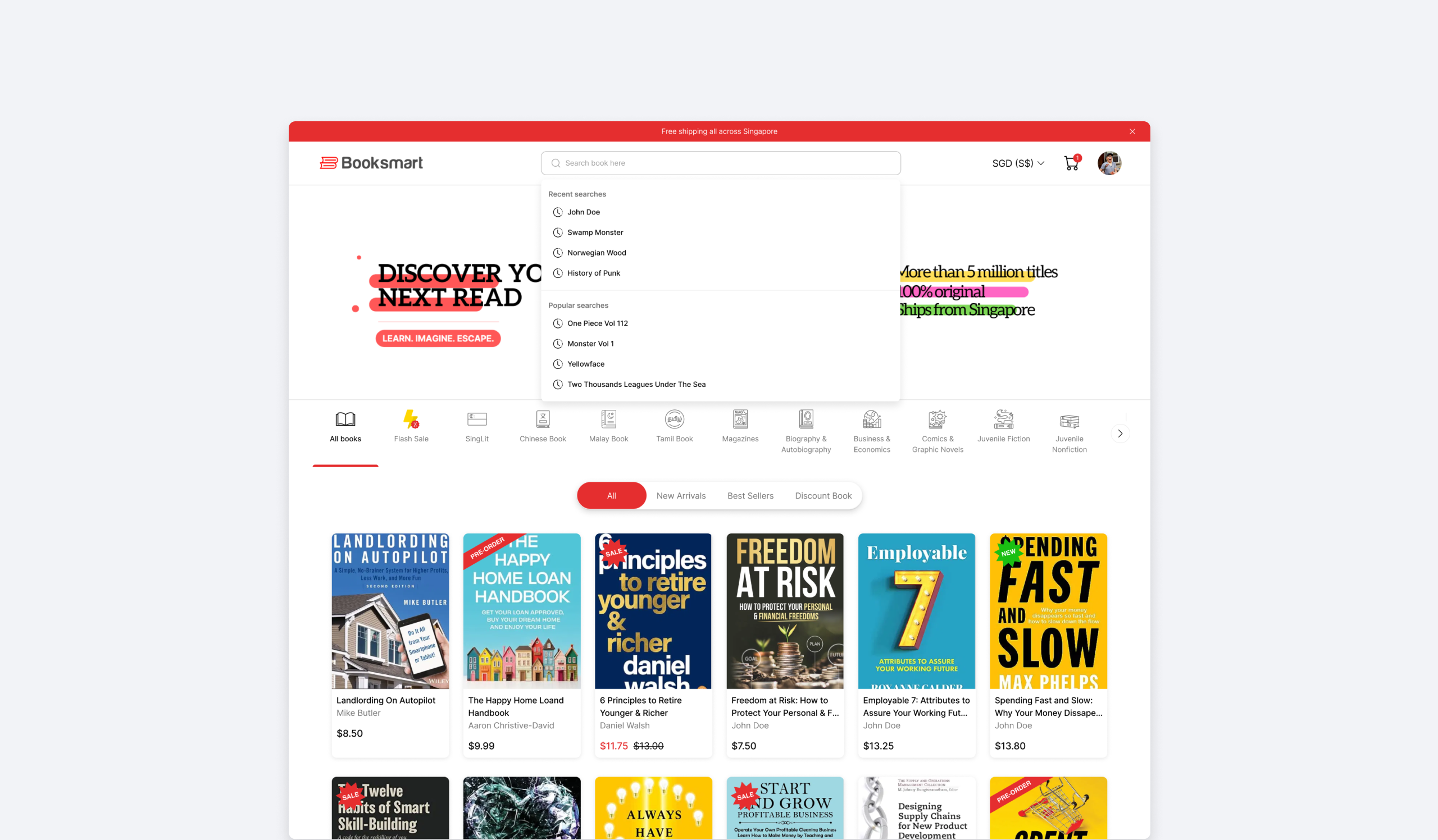
Cross-Discovery Search
Search became an ecosystem bridge rather than a plain lookup tool. Clicking into the search bar (zero-state) immediately shows suggestions to guide intent before the user even starts typing.
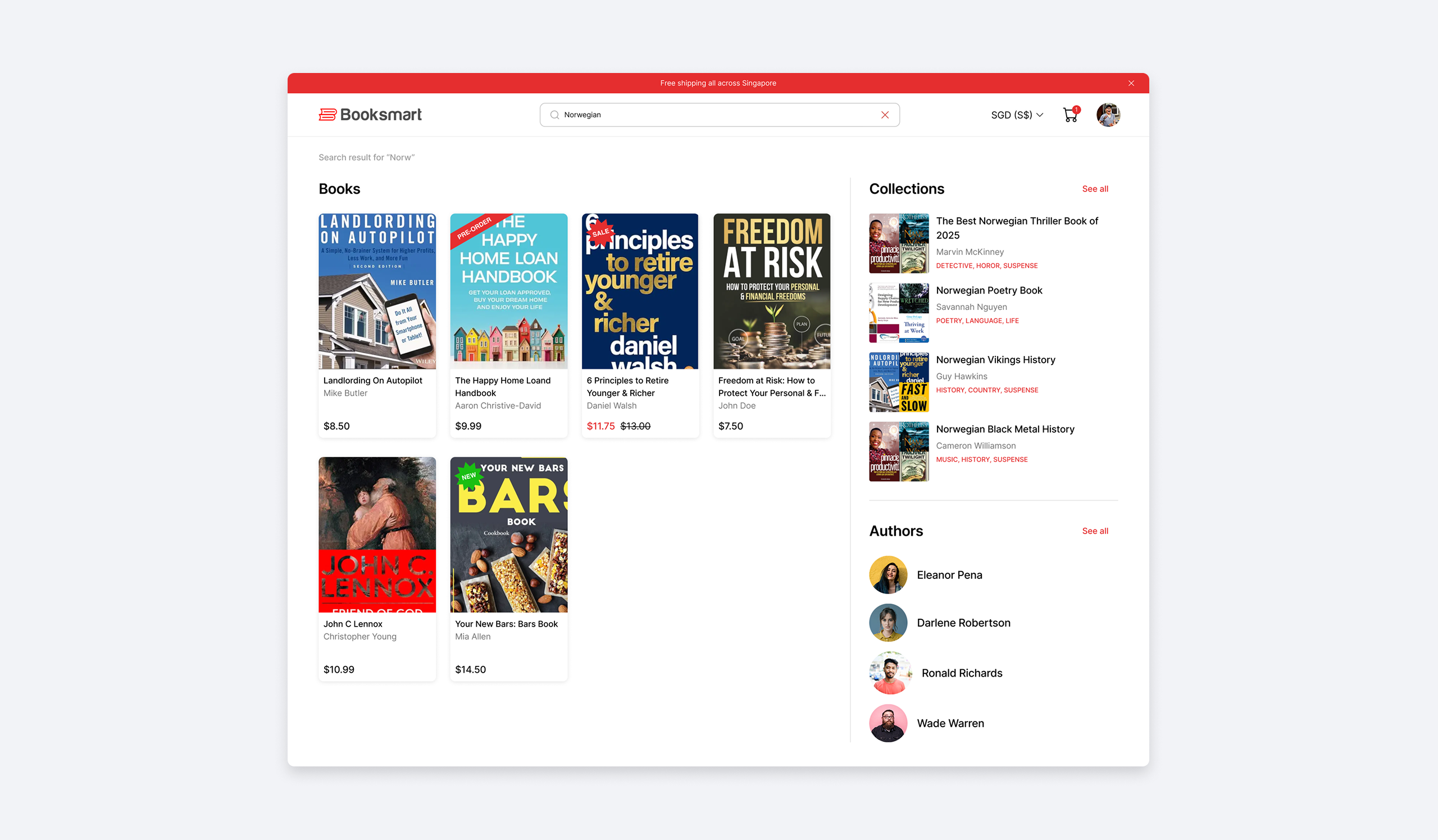
Search results now surface books alongside relevant “Collections” and “Author” profiles, encouraging community curation and laying the groundwork for Booksmart’s upcoming affiliate program.
Driving Early Purchase Decisions with Promo Visibility
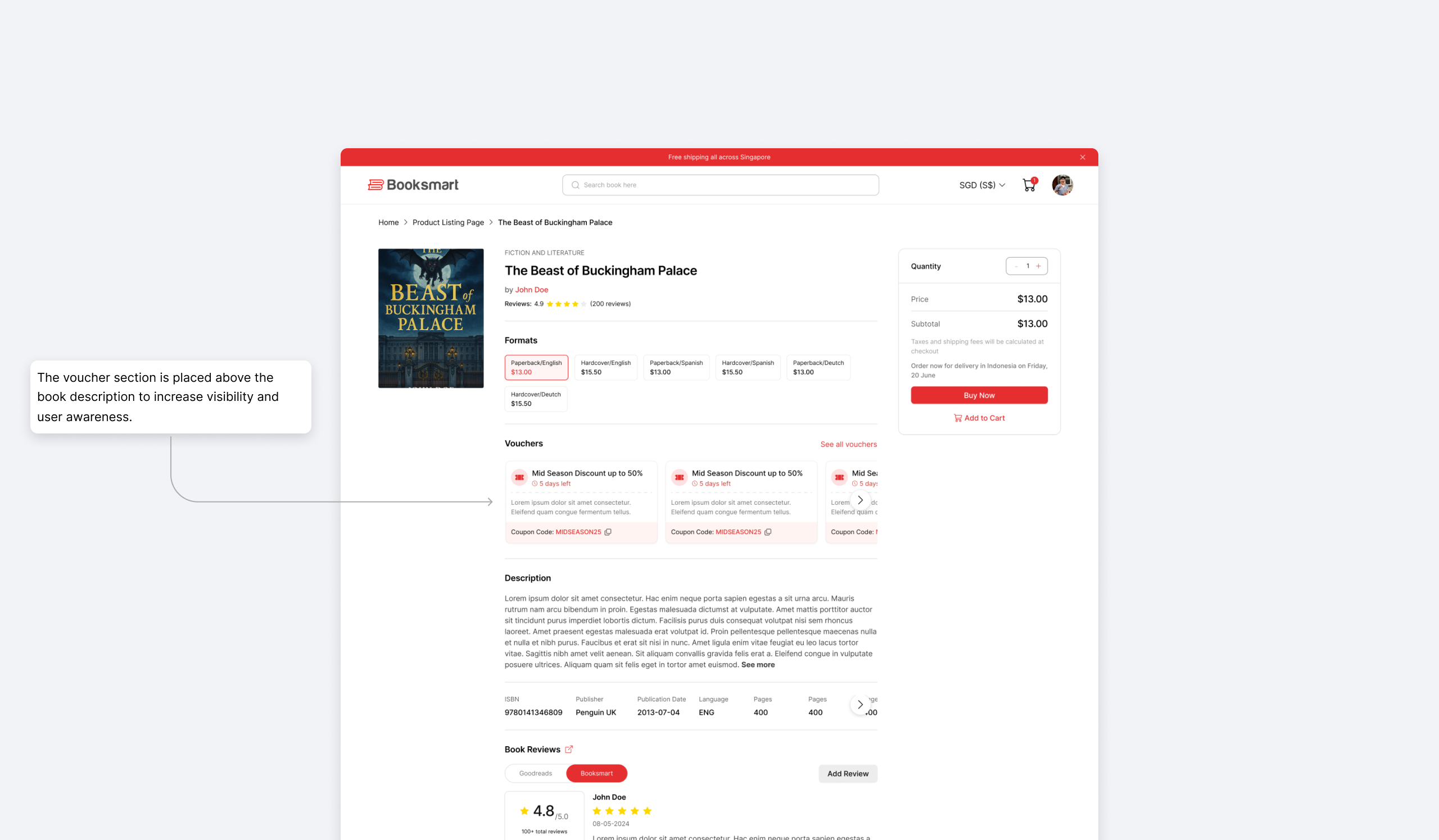
The legacy system hid promos until final checkout, so users browsing the Product Detail Page had no visibility into discounts, weakening purchase intent and often pushing them to leave the page just to hunt for promo codes. I brought discount visibility upfront onto the Product Detail Page itself, creating a psychological trigger that speeds up purchasing decisions.
Contextual Voucher Section
Promos are dynamically sorted by relevance to the specific product, prioritizing high-value discounts like free shipping or bundles, so users get an immediate sense of value without hunting for codes.
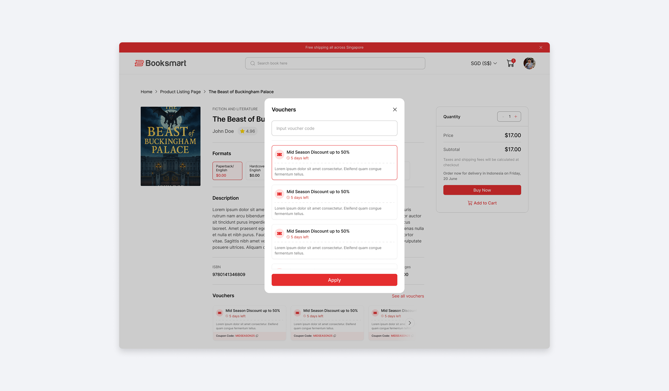
Extended Promo Management
A “See All” modal lets users browse every available promo without leaving the PDP, including a manual input field for edge cases like B2B clients using special admin-generated codes.
Reducing Transaction Friction with Segmented Checkout
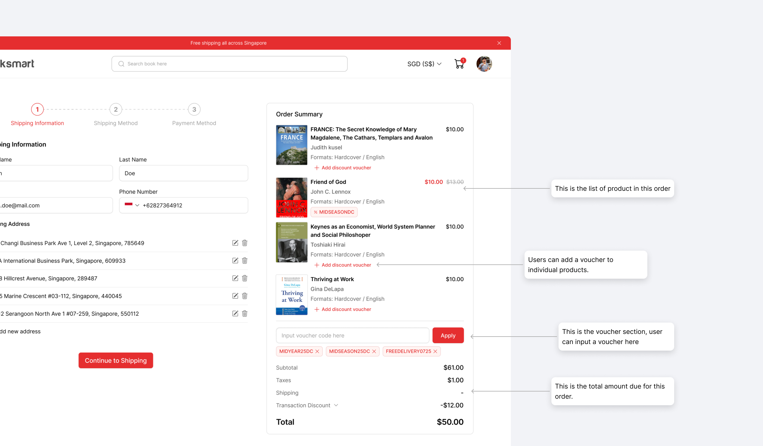
The legacy checkout was one massive, single-page form for both shipping and payment, with no real-time visibility into cart contents while filling it out, raising drop-off risk from sheer uncertainty. I restructured the layout entirely, splitting the input process and adding a persistent reference point throughout.
3-Step Checkout Stepper
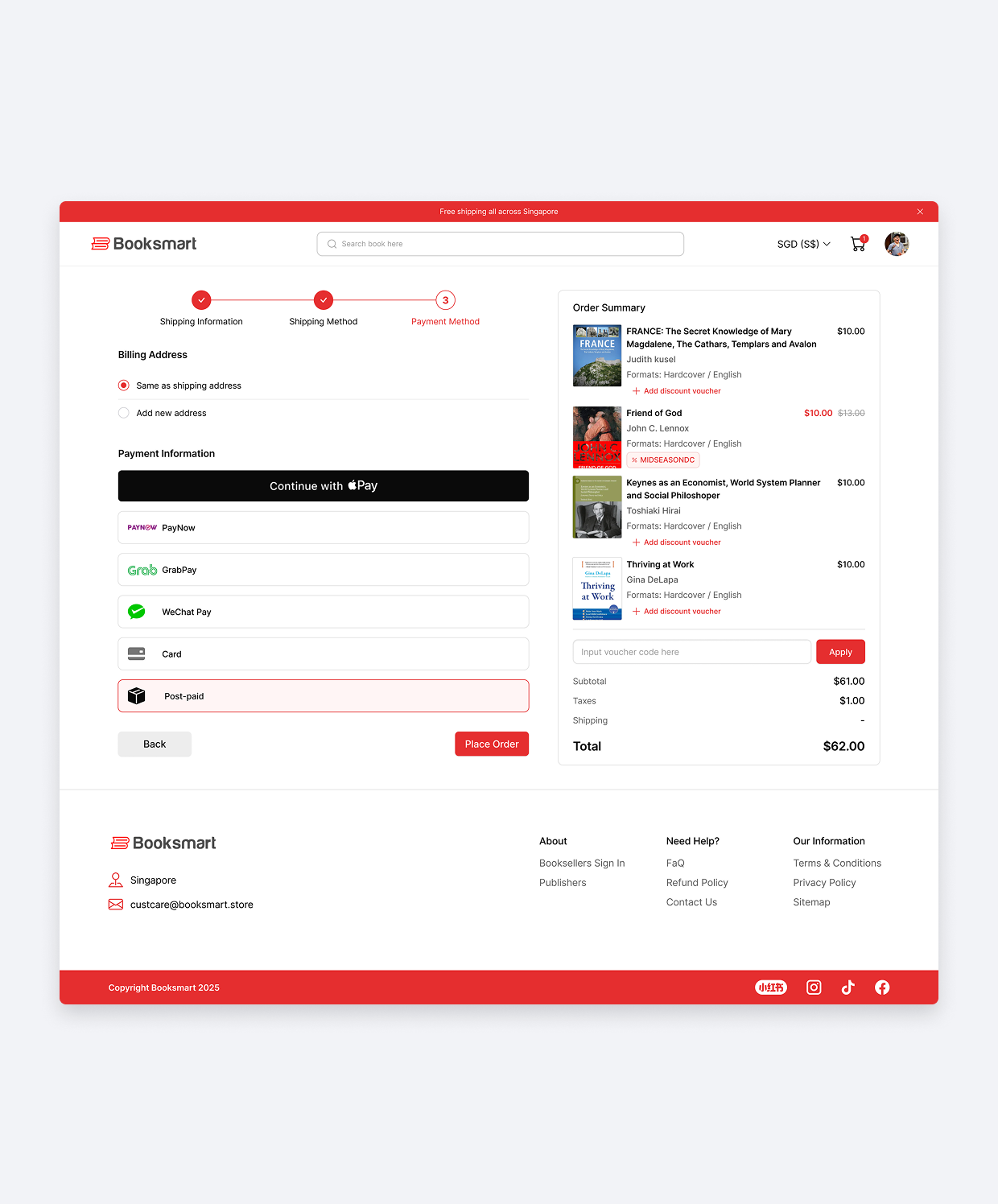
I broke the form into three digestible stages: Shipping Information, Shipping Method, and Payment Method, so users focus on one task at a time instead of facing an intimidating wall of fields.
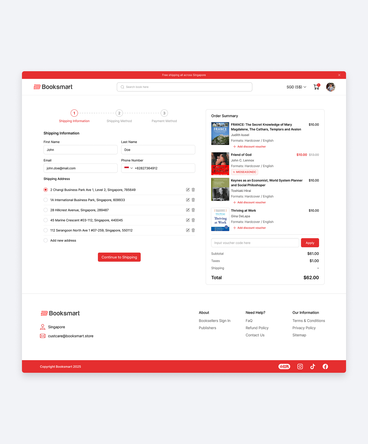
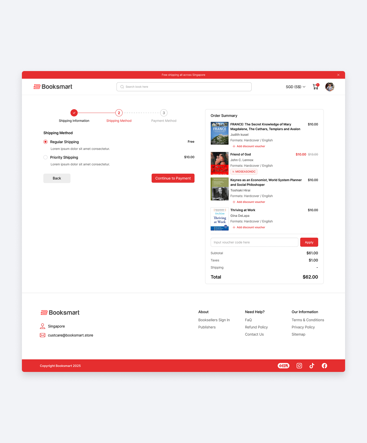
Persistent Order Summary Sidebar
A sticky Order Summary on the right keeps items, applied vouchers, and total cost visible throughout all three steps. For B2B bulk purchases, the item list scrolls independently while the pricing breakdown and total stay anchored at the bottom, uninterrupted.
Outcome
The result is a shopping journey that removes friction at every point users tend to drop off. Browsing no longer means bouncing between pages just to see more books, discounts are visible the moment a user considers a purchase instead of being a last-minute surprise, and checkout no longer feels like filling out a tax form with no idea what’s actually in the cart. Every change traces back to the same principle: keep users oriented and moving forward, whether they’re an individual reader browsing casually or a B2B client processing a bulk order.